
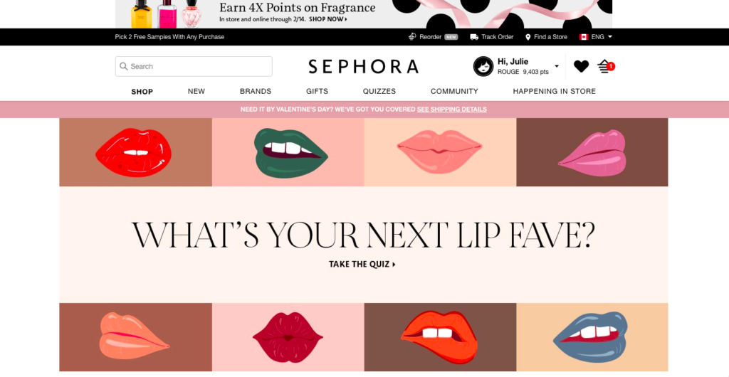
We had the pleasure of having guest speaker and designer, Mauvé Page come in to talk about web design and type on screens. When we look at a website page, it is not only about the text, but also the context, format and design of how we shape it. To create the perfect page, there has to be balance, rhythm, proportion, contrast, and unity. Together, these 5 design principles will bring a deeper engagement and first impression to the website. A website design is like a blank canvas ready to be painted, much like the art of makeup and its technique for a beautifully applied face. Today, I will be discussing about the 5 design principles for my favourite online website — Sephora, the destination for beauty and skincare. I will be analyzing the design decisions made and see if the website is successful on following the design principles based on the screenshots of the site below:
Balance
The first design principle is balance, which is the visual equilibrium, symmetrical vs. asymmetrical and white space of the page. This is how we see the page, when we first glance at it. When I first go on Sephora’s page, it may seem a bit confusing to look at for new users, as there are many different sections on the site. At the very top of the page is a promotional banner for fragrances. Below that are the main menus to browse for specific items. The centre point is the quiz section banner, which changes banners to other promotions on different days. I do like how there is enough white space that the page doesn’t feel too overwhelming.
Rhythm
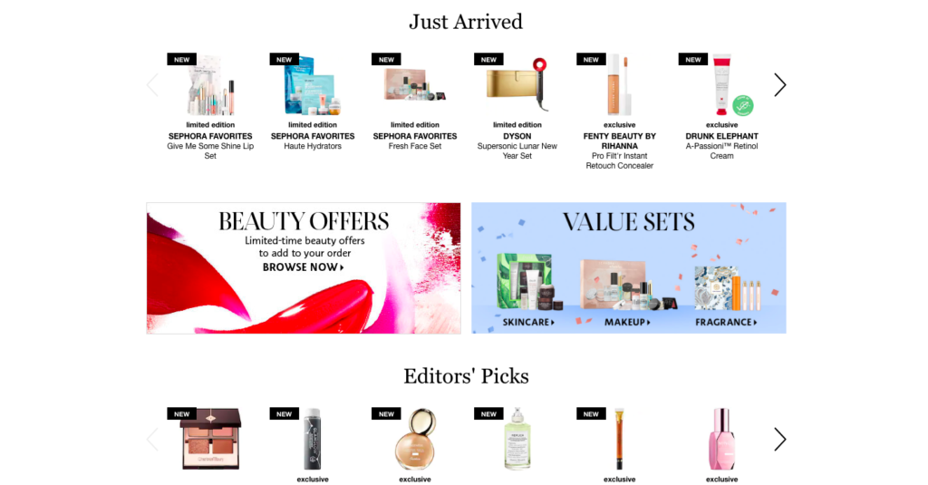
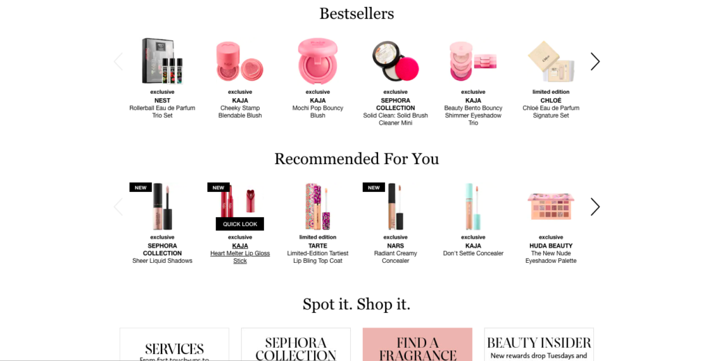
The next design principle is rhythm, which is the movement through space. It helps to create predictability and order in design, including repetition of elements, sequencing and gradation. A great website has regular, progressive flowing rhythm. I feel that Sephora’s website could improve on this aspect because I don’t think there is the best of balance between the elements and sequencing. For example, there are too many promotions on the page with different sizing. There is a small and thin promotional banner at the top, a huge quiz banner on the top centre, but as you scroll down, there are even more promotional blocks in another type of sizing. I feel the flow of the page would look better if the sizing is more neutral for the smaller blocks. What I do like is how they list out the headings such as Editor’s Pick, Bestsellers, Recommended for you with the different pictures of the products underneath each one. It creates clarity and consistency when looking at those sections.
Proportion
Proportion is the relative size and scale of different elements in the design. It is used to create emphasis and importance, but also tension and emotions on a page. As stated in the rhythm section, the sizing and proportion of the elements are very important to promote good flow on the page. I like how there is the main centre focus on the gigantic quiz banner because it draws our attention to it and makes us want to click it. I do suggest that the other elements such as the smaller banners should be more balanced in size.
Contrast
Another design principle is contrast. It is used to create emphasis in your design. It can be the use of colour, texture, size, and shapes used to create this contrast. There usually is a primary point of focus and ideally, no more than 3 main areas of focus. I feel the website uses good contrast in the design. I like how all the colours work together to make the page interesting and eye-catching. There is enough contrast in the fonts and typefaces that we can see the legibility. There is readability, as the font colours do not blend together. There is also the primary focus point on the large banner, which I think they do a good job of in drawing eyes to the centre of the site.
Unity
Finally, unity is all of the principles working together, creating a harmony of design. This includes the consistency of colour, forms and variety. Sephora’s website has a good proximity of spacing, consistency and predictability. The elements work together in unity to match user expectations. Each one of the elements has a purpose and focuses on the key content of the page. The warm colours used on Sephora’s website create an invitation for people to look at the site. There is good balance throughout the page, but there should be an adjustment on some of the banners sizing. It may be a little messy at first glance, but otherwise, I feel Sephora is easy to navigate once you visit the site more often!
thanks for reading! ❤️
