

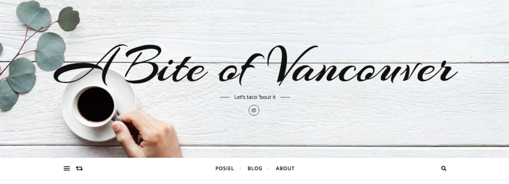
As an avid foodie who loves to eat out, I am excited to review Kimberly’s blog, A Bite of Vancouver. I thought her blog was easy to navigate and simple and sweet to look at! I really love how her cute slogan for the blog is “Let’s taco ‘bout it”. It fits perfectly with her theme design catered for a food/restaurant review and recipes blog. This review’s focus will be on her website design and will concentrate on the different parts of the theme, customizations, typography, layout, social media integration, site structure, usability, and other design decisions she made.
The focus will not only be on the website design, but also how we create the design to welcome our audiences. As talked about in Danah’s reading, this integrates with the need to search for a public of our own. We can create a space for people with the same interests to connect with and to share and learn what we see. I feel Kimberly’s blog will be a great public for people who are interested in knowing about new restaurants and recipes to try. Reading through her blog, I understood why she made certain design decisions and content. For example, she talked about changing her theme to allow for a sidebar and slider being a food blog. She chose the new theme for its colour scheme, responsiveness and how the home page allows for short snippets of posts so viewers are encouraged to click on them individually if they want to read more. I thought she made good choices on her design layout and I will be analyzing the decisions she made to see what could also be improved.
Below are screenshots of her home page:
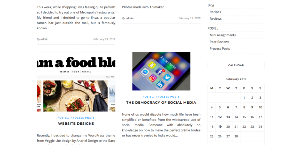
Design and Layout: The 5 Design Principles
I reviewed her design and layout based on the 5 design principles we learned in class that was introduced by guest speaker, Mauve Pagé. I wanted to analyze the design principles of balance, rhythm, proportion, contrast, and unity based on Kimberly’s blog and see what I can suggest to make her lovely blog even more outstanding! I will also mention about other design choices she made such as the theme and customizations, typography, social media integration, and more.
Balance
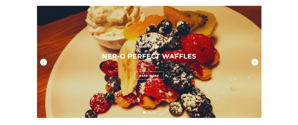
The first design principle is balance, which is the visual equilibrium of the page. This is how we see the page at first glance. Kimberly’s blog has good use of white space, but I feel the balance of the posts need to be worked on. There is a top header banner, a featured slider with different posts, another featured post below, and under that are two columns of posts, and a sidebar next to it. I think the symmetrical space will work better if she cuts out the second featured post on her home page because there is already a featured slider image of posts. It will make the balance of the page more even.
Rhythm
The next design principle is rhythm, which is the movement through space. It helps to create predictability and order in design including repetition of elements, sequencing and gradation. Scrolling through the home page, I think the flow of the posts would be better if there was only one column following the featured slider posts, or maybe just the two columns without the second featured post.
Proportion
Proportion is the relative size and scale of different elements in the design. It is used to create emphasis and importance, but also tension and emotions on a page. The top header banner provides a good top frame for the overall blog. Below the header image is the second largest element on the page – the featured posts slider. I really like how there is a main focus on the slider, as it makes the readers want to click on it and read more.
Contrast
Another design principle is contrast. It is used to create emphasis in your design. It can be the use of colour, texture, size, and shapes used to create this contrast. The primary focus I see is the featured posts slider. I noticed the slider photos use warm, inviting colours to create a welcoming image to the blog. Throughout the blog, I think the overall colour scheme works very well. There is enough contrast between the bolder colours of the photos and the white background. The only thing I suggest changing is the colour of the top header banner to make it pop more.
Unity
Finally, unity is all of the principles working together, creating a harmony of design. This includes consistency of colour, forms and variety. All of the elements has a purpose and focuses on the key content of the page. So for the unity in terms of the overall theme and customization design of her page, here are some of my thoughts: As mentioned above, I feel the top banner image is slightly bland for a food blog, I suggest a bit more colour to brighten it up. Perhaps, she made the header image more gray-scale in order for the other posts to stand out more, but since the top banner is what we first see when we look at the blog’s front page, it should catch our eyes with some stronger, bolder colours like her other blog posts. I agree with how she mentions that visuals are very important in attracting viewers. I like how she included photos in her posts to make it interesting and easier to read. I would recommend to add more photos for the food and restaurant posts, such as maybe describing how the restaurant looks like and the vibe and atmosphere inside to give a more in depth review. Overall, I really appreciate how the theme was simple and allows for good navigation and flow of the page.
Other Design Choices:
Social media integration
Her use of the Instagram logo with the link embedded and inserted in the top header banner makes it excellent in showing easy access to her Instagram account.
Typography
The typography is easy to read and I like how the main banner image has a different typeface than the rest. It definitely makes it stand out and draws attention to the blog’s name of A Bite of Vancouver.
Site structure and usability
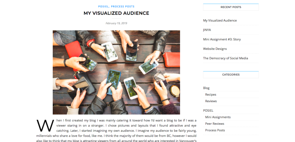
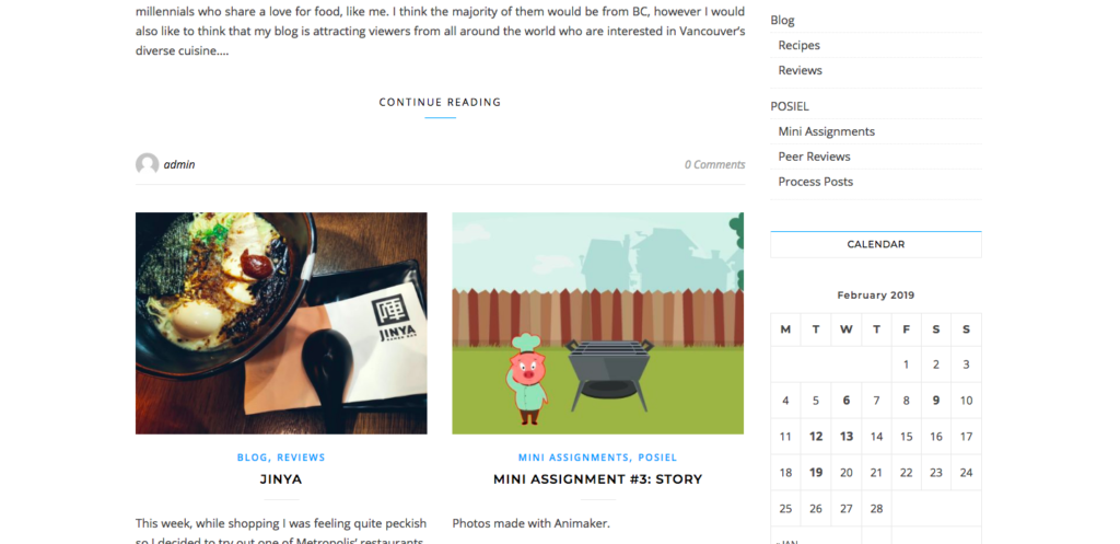
There is good use of white space and it is simple to read and navigate her posts. She mentioned how the theme allowed for a side bar because it made the site look more organized. She added the main slider to feature photos because it is important to attract the viewers’ attention. Another good idea I can suggest is to possibly add an Instagram gallery to the side so we can see more featured food pictures. I notice she has an alternative sidebar button on the blog page, but I am not sure if it is needed because it has the exact same search function and menu as the headers at the top of the page below the header image banner.
To conclude, I want to touch upon Travis Gertz’s article on design, I agree with him when he states that:
“The products we work on are meticulously monitored, optimized, tracked, and tweaked, more than any other medium and during any other time in history. The practice of design involves a whole new mountain of influence crunching down, strong arming decisions, imposing standards, and questioning abilities.”
Through each of the posts we create, we are making new design decisions and content every step of the way. Blogs are created through all the different steps we take to make it unique and our own. Time and effort can be seen and reflected through the product of our design. I think Kimberly did a wonderful job in learning to evolve from the different design choices she made. She explained the reasons she chose to change certain parts of her blog, and what she wanted to include to make her blog interesting to the readers. What she can work on is creating a better balance on the home page format by using less feature posts or perhaps even making one column for posts, instead of two. Changing her top header banner to something more bright and appetizing will make her food blog stand out more. It was engaging to read Kimberly’s food blog and I will definitely continue checking out it out and hope to see more delicious food and restaurant review posts!

